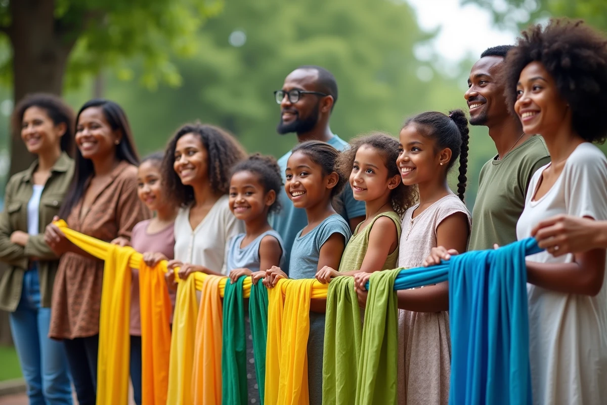
A logo, a shade, a collective momentum: sometimes it only takes a simple visual detail to create a feeling of unity and mutual aid all over the planet. Color is never neutral. It shapes our perceptions far beyond trends, challenges boundaries, and finds its way into all communication strategies. International brands know this: an inappropriate color choice can weaken their image, while a carefully considered palette fosters trust and engagement. Companies move cautiously, but behind every selected hue, the thought process is based on precise studies and lessons learned from successful campaigns.
Why does color convey a message of solidarity and mutual aid in marketing?
It is impossible to ignore the influence of color psychology in the design of brand identities. Color by color, experts know that these choices trigger emotions, sometimes subtle, but always present. Whether it is to capture attention or instill a sense of trust, each shade tells a story, inherited from an era, a culture, a context. Nothing is left to chance.
However, the meaning attributed to each color varies greatly depending on the region of the globe. Blue, for example, inspires serenity and reliability in Europe, but takes on tones of mourning in Iran or protection in the Middle East. This cultural diversity feeds a question that never leaves communicators: which color symbolizes solidarity? The article ‘Solidarity: which color symbolizes brotherhood and mutual aid? – Hermaphrodite’ echoes this, questioning the quest for a universal language on brotherhood.
At a time when messages circulate from one continent to another, one must navigate the plurality of interpretations. Companies seek a color that brings people together while respecting local sensitivities. The balance is delicate: it is about getting it right without erasing the diversity of perceptions. This is the art of contemporary visual marketing.
The symbolism of colors: an overview of shades associated with solidarity around the world
The symbolism of colors reflects the richness and complexity of societies. Yet, some major themes emerge across the planet. Here are the key points to understand the impact of colors on solidarity:
- Red: a symbol of vitality, passion, but also sacrifice. In Russia or South Africa, it evokes collective struggle and courage; in Asia, it resonates with luck and happiness. Its visual strength gives it a unifying power while allowing for multiple interpretations.
- Blue: the color of trust, calm dialogue, and hope. Present in many sectors related to aid or health, it reassures and invites cooperation. In Europe or North America, blue stands out for its unifying effect.
- Green: associated with nature, growth, and balance, it embodies health and renewal. In the Arab world, it carries a spiritual dimension and symbolizes fertility. It is also widely used in the field of social and solidarity economy.
- White: between purity and the end of a cycle, white changes meaning depending on the continent. Peace and birth in the West, it is associated with mourning in many Asian countries.
- Pink: the color of tenderness, softness, support, and protection. It is prominent in campaigns that promote compassion and support.
- Orange: synonymous with energy and friendliness, orange is favored for its ability to create connections. In India, it takes on a sacred and communal dimension, highlighting the importance of collective commitment.
Each hue shapes a visual narrative. Colors express solidarity through sometimes contradictory heritages, but always carry a deep meaning.

Brands that embody mutual aid: inspiring examples and winning strategies
For brands, color is never just a detail. It forms the foundation of their visual identity, the first reference for the public. From the first contact, the chosen hue will influence feelings and often the decision to support a cause or service. The blue occupies a prominent place: it embodies reliability, serenity, and cohesion. Companies working in health, personal assistance, or insurance adopt it massively to inspire trust and demonstrate a willingness to help.
The red, bolder, signals urgency, life, and commitment. Used judiciously, it captures attention and energizes a campaign, but it must be controlled to avoid an anxiety-inducing effect. The green naturally stands out in organizations focused on ecology, health, or sustainable growth. It conveys a sense of balance, well-being, and renewal. NGOs and solidarity structures choose it for its positive and unifying impact.
In a warmer approach, pink and orange bring a touch of humanity and creativity. These are often the preferred colors for solidarity campaigns that aim to touch the public’s heart, break down distance, and highlight mutual support. They allow for personalizing the action, making it more accessible and less institutional.
The success of brands that embody solidarity lies in a subtle alchemy: aligning logo design, color choices, and the authenticity of the message. The most impactful campaigns are those that respect cultural diversity and use color as a lever for adhesion, mobilization, and trust. In this field, color is not just a superficial layer; it becomes a true shared language, capable of uniting, moving, and engaging an entire collective.
Through the colorful prism of marketing and communication, solidarity is expressed in shades, symbols, and emotions. And tomorrow? Perhaps a new, unexpected color will come to disrupt the codes and pave the way for other imaginations of mutual aid across all continents.